Web Accessibility Part II – 5 Ways to Make Your Blog More Accessible to the Disabled
Guest post by Jenny Lewis
As pet bloggers, we want our content to be accessible to a vast audience of pet lovers. The disabled are among the ranks of devoted pet parents who benefit greatly from our fun, informative blogs. Have you thought about how “accessible” your pet blog is to the disabled?
In Part 1 of this series, we identified a number of issues that might be encountered on a site that is not web accessible. Whether it’s a blind person trying to “read” the page with a screen reader, a low vision user who is having a hard time seeing the text, or someone having difficulty dealing with five “Learn More” links on one page, there are steps we can take to help visitors have a greater online experience.
Web accessibility can be quite technical, with detailed code and dozens of possible ways to make a website more compliant. Most of us use Blogger or WordPress, and are not developers, but there are some basic steps each of us can take to become more accessible.
- Use easy to read font styles. “Arial” font is a lot easier to read than a script font such as “Gigi.”
- Use a font size of at least 11pt. If a font size is too small, your content can be unreadable. The text “I love dogs” in size 11pt,
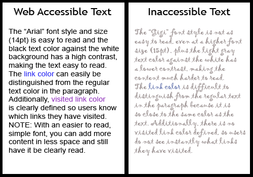 is easier to see than “I love dogs” in 9pt font size.
 - Use a font color that contrasts well against the background. If your background is white, use a dark color font. If your background is black, use a very light colored font.
- Add alt text to each image so screen reader users can “hear” it. An image with text on it should have alt text that includes that information. (Images added in Blogger, have a “Properties” link associated with each one where you add the alt text).
- Make each link unique. Instead of having a series of links entitled Pixel Post 1, “Pixel Post 2, etc., have each link state a brief title, such as “Pixel Finds Long Lost Kibble”, “Running in the Snow with Pixel”, etc. so that blind users can decide which posts they want to read.
The image of Pixel’s two Dog Park Posters illustrates a web accessible image vs. an inaccessible image. The poster has a photo of 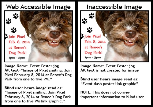 Pixel and detailed information about an upcoming “Meet Pixel” event. Several blind fans would love to attend. When posted on the blog, the image should have alt text added, that includes the event information from the poster. If alternative text is missing, blind fans will not hear that crucial bit of information read to them by their screen reader. It would unfairly deny disabled readers that opportunity, simply because they could not “see” the poster details.
Making your blog more web accessible for the disabled is doable, it just takes a little time and patience. In part three of this series, we’ll take a look at some Free Accessibility Tools to help bloggers wishing to dig deeper into making their blog more web accessible.
Jenny Lewis: web accessibility consultant by day; pet blogger/photographer by night. Visit Pixel Blue Eyes, Her Tails of Adventure, where Pixel shares her world.