A Beginner’s Guide to Google Analytics: The Data You Need to Get Started
In my last post, I explained how to set up Google Analytics in 3 Easy Steps. Now that the initial setup is handled, it’s time to take a dive into the ocean of data that is Google Analytics and find some info about your site that you can act on immediately!
Going Down the Rabbit Hole
As I raved in my last post, Google Analytics is easily one of the best tracking platforms out there. Not only is it free, but it provides more than enough tools and data to gauge how your website is being used and how you can improve it.
For some new users, though, it may be too much information. Jumping into Google Analytics for your first set of data can be like jumping in front of a fire hose for a sip of water; there’s just so much data that it can run you over if you’re not careful. Fortunately, the platform is set up in such a granular fashion that it’s easy to separate the data into smaller, more digestible chunks.
The goal of this post is to highlight the most important (and interesting!) areas a new blogger will likely want to check out early and often. While almost all the data in Google Analytics has some value, these sections are the spots that are going to give you the most insight into your blog’s traffic and how your audience is using the site.
Audience Reports
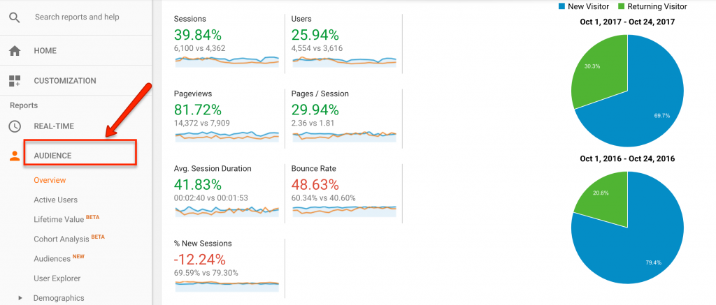
One of the most valuable views in Google Analytics is the “Audience Report.” This section provides a wealth of insights into how users are viewing your site, what devices they’re using, what area they’re in, and more. One of the most useful sections, though, is the “Overview” section.
This Overview section is almost like taking a quick read of your website’s pulse. Here, you’ll find summaries on Sessions, Users, Bounce Rate, and more—all vital stats for your blog. In fact, this section is one I visit each day to get a quick view of how my clients’ sites are doing. By altering the date range (found in the upper right-hand corner), you can instantly monitor your site’s activity for any changes.
Aside from the “Overview” option, there are several other Audience reports that are worth regular views. For instance, the “Mobile” section can tell you not only what kind of devices your audience is using (either desktop computer, phone, and tablet) but also what brand they’re using (such as iPhone, Samsung Galaxy, Kindle Fire, etc.). The “Geo” section can also be useful, as it breaks down where your audience is located. Information like this can be particularly helpful when deciding what time is best to post new content (for instance, if most of your audience is in California, it might be better to post during peak hours in the Pacific time zone).
Acquisition Reports
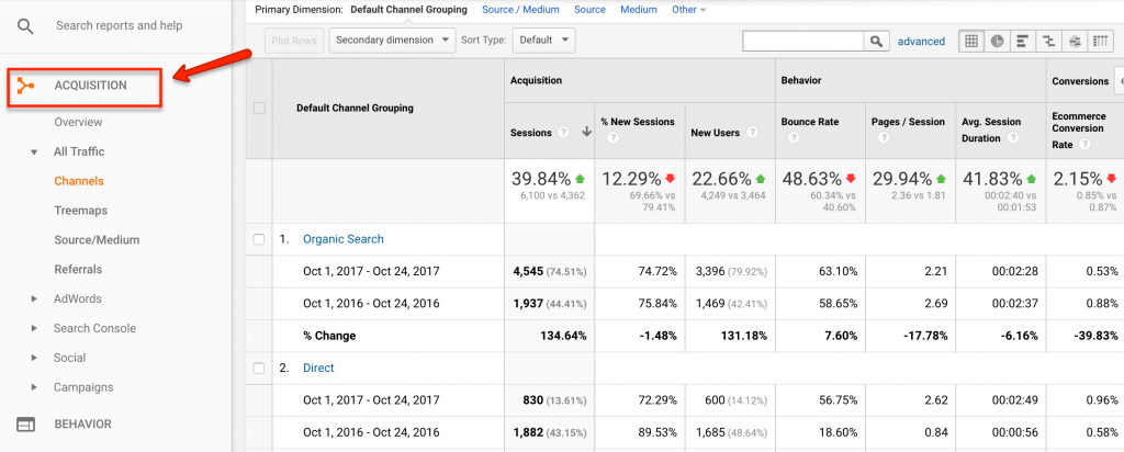
As an SEO, the Acquisition Reports section is by far my favorite. These reports focus on how users reached your site in the first place, whether it was from a search engine, a social media post, an email, or something else. If you’re actively marketing your blog to grow your audience, this section offers more than enough data to help gauge your success.
One of the most valuable sections is the “Channels” option (located under the “All Traffic” option). This breaks down traffic by which channel they used to come to you site, such as Organic Traffic (meaning they used a search engine like Google or Bing), Direct (meaning they directly typed your website domain into their browser), Referral (they clicked on a link to your site from another site), and more.
This data is priceless in the right hands. For instance, if you see your blog is not receiving any traffic from Social channels, then you know it’s time to rethink your social media strategy. Or, if you notice that the traffic from organic search has a particularly high bounce rate, then you know your content isn’t answering the questions those searchers have. When used properly, this data can help you shape each of your marketing strategies moving forward.
Behavior Reports
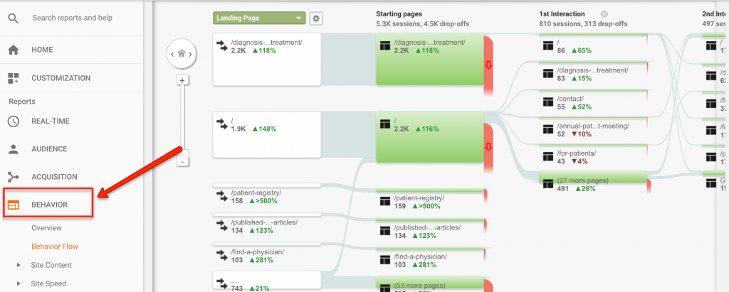
While the Audience reports let you know who’s coming to your blog, and the Acquisitions reports tell you how they got there, the Behavior reports can tell you what they did while they’re on your site. As you can imagine, this information can be very useful for seeing if your content is resonating with the intended audience or if there are any hurdles preventing users from fully interacting with it.
Of the Behavior reports, one of my personal favorites is the Behavior Flow section. In this report, Google Analytics takes your traffic and provides a visual representation of how traffic traverses through your site, beginning on the page of arrival and showing each page they visited and eventually exited. This information is particularly useful if you’re trying to figure out how and why user may be leaving your site (instead of sticking around and reading more articles).
Along with this data, the Behavior reports also include data on the entire site’s content, allowing you to look at engagement metrics for each page on your site. There’s also the Site Speed section, which helps you figure out which pages are taking too long to load—something you’ll want to immediately remedy in order to provide an optimal user experience.
Just the Tip of the Iceberg
Obviously, this is only a tiny fraction of the information Google Analytics puts at your fingertips. While the above reports are enough to give you a comprehensive view of your site’s performance, I highly recommend digging deeper into the data to learn as much as you can. In fact, you may even want to spend some time in Google’s free <link: https://analytics.google.com/analytics/academy/> Analytics Academy <link> to learn how to truly take advantage of this robust tool!
Michael Ferrari owns and operates Pen Cap Online Marketing, an agency specializing in search engine optimization. When he’s not helping businesses dominate the search rankings, he’s most likely hanging out with his wife, son, and beagle. You can reach him at “michael(at)pencapseo(dot)com”.
Images: golubovystock/Shutterstock.com and screenshots courtesy of the author


