New Twitter Design: 40+ Sources of Information and Inspiration!
The new Twitter design and features have been rolling out since April, but don’t feel bad if you haven’t updated yours yet. You’re not alone!
So let’s start with a couple of examples who haven’t uploaded a new header image to inspire you with what good company you’re in (as of June 6, 2014):
Procrastination or Minimalist Design?
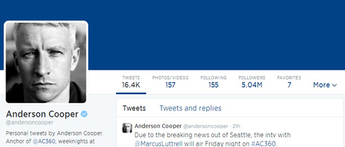
1. Anderson Cooper:
It’s possible that not uploading a header image in the new, larger — ginormous? — size was a conscious design choice. The default header bar is clean and simple, you can choose your own color, and it minimizes the vertical dimension of the header, letting more content show. And this one takes advantage of Cooper’s recognizable face.
Knowing that your username will appear directly under your profile image could make this a sensible design choice for some, especially if you have a color that can be associated with you and your brand.
2. American Express OPEN Forum:
This one does seem purposeful, matching the header color with the OPEN logo and capitalizing on the white navigation bars above and below the color bar.
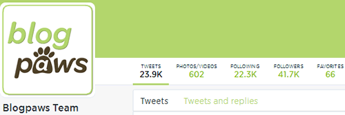
3. BlogPaws:
For the moment, I’ll claim that’s why I haven’t updated the BlogPaws Twitter profile yet! Experimenting …
Twitter’s New Features
Before looking at some more elaborate header design options, let’s take a look at the new Twitter features. Here’s what the Twitter blog announced in April:
The new web profile lets you use a larger profile photo, customize your header, show off your best Tweets and more. Here are main features:
- Best Tweets: Tweets that have received more engagement will appear slightly larger, so your best content is easy to find.
- Pinned Tweet: Pin one of your Tweets to the top of your page, so it’s easy for your followers to see what you’re all about.
- Filtered Tweets: Now you can choose which timeline to view when checking out other profiles. Select from these options: Tweets, Tweets with photos/videos, or Tweets and replies.
The Best Tweets feature happens automatically, but you can now show off your current favorite tweet by Pinning it to the top of your timeline. When you want to pin a tweet, click the ellipsis (…) below the tweet and select “Pin to your profile page” like this:

Anytime you want to feature a new tweet, just pin that one and it will replace the one before it.
The Filtered Tweets feature lets you look at other people’s profiles in a variety of ways, just by clicking Tweets, Tweets and Replies, Photos/Videos, Following, and so on, in the newly simplified navigation bars:
I especially like the way followers are displayed visually in the new Twitter layout:
To me, this makes it much easier to visit others’ profiles, review their followings and followers, and select new people you may want to follow. This might be the strongest argument for paying close attention to how your header looks in the various places and sizes it will appear in Twitter’s new design.
How to Make a Header Image for the New Twitter Layout
Okay, back to the design question. The basics are pretty simple: the recommended size for your profile image is 400 x 400 pixels and 1500 x 500 for your header image.
But of course, it’s not that easy. Your profile image will get resized down to at least 48 x 48 pixels in the timeline and should remain recognizable. And your header image will get resized all over the place, from desktop monitors (mine is 1920 pixels wide) down to smart phone screens. In addition, the two images should work together on your profile, where the profile image will overlay the header image to varying degrees and in varying locations, depending on the screen.
Such is the beauty and the challenge of responsive web design!
(BTW, I tried using a couple of online screen size/resolution simulators — Screenfly and InfoByIP — but Twitter prevents them from display its pages in iframes, so I’ve been limited to testing on my desktop monitor and cell phone, a Sumsung Galaxy S4 with the Twitter App version 5.12.1)
4. Header Template Source: One way to attack the problem is using one of the templates that designers have already created. I found a good one by Greg Trujillo over on CT Social that includes lots of explanation and a downloadable Photoshop file to work with.
However, I discovered that in spite of the obvious care taken to identify “content safe zones” in the template, it did not work when my new header was displayed on my Galaxy S4 phone.
5. Enter Canva: I recently discovered Canva and then last week attended a Hangout with Mia Voss, Guy Kawasaki (Canva’s new Chief Evangelist), and Peg Fitzpatrick (Canva’s Head of Social Strategy). While there are image editing and design tools with more bells and whistles (I use Adobe Fireworks for most web design work), I am blown away by how fast and simple it is to make images specifically for social media using Canva.
For me, using Canva makes good old trial and error a better option than templates! I’m so impressed, I made this short video to show how quickly I was able to make the new header for my personal Twitter account:
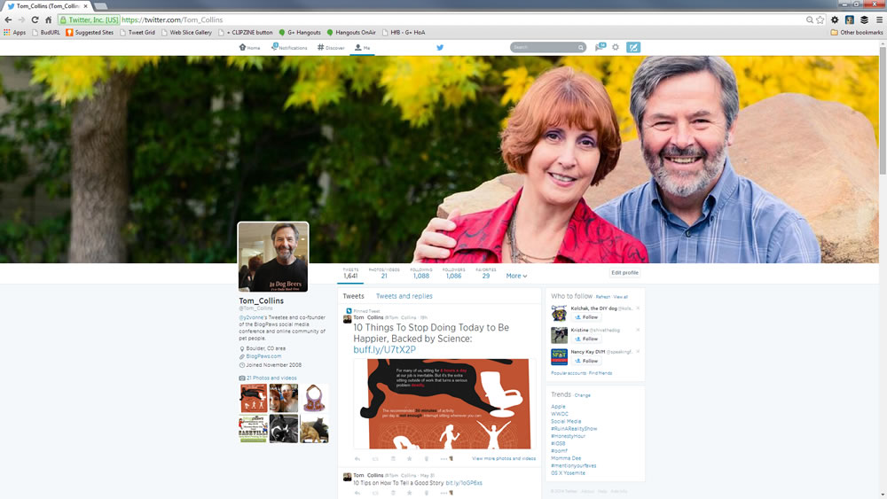
As the video shows, the various desktop, tablet, and mobile screens resize, reshape, and reorient your header and profile images in ways that might change how they work together. Here’s just a small sample showing how mine displays:
On my 1920 x 1080 desktop monitor, the header image expands to the full width of the screen. But my profile photo position stays fixed in line with my account info and content, so that changes where and how much it overlays the header:
Because your image can be expanded so much, I recommend starting with the highest resolution you can get away with while staying under Twitter’s (generous!) maximum 5 MB file size for the finished header image. Since Canva saves your image as a PNG file, the size will be somewhat larger than the same image as a JPEG or GIF, but the quality will be better, too.
In a browser window at 800 x 600 pixels, the header image shrinks down to just about the width of my account content. But my profile pic keeps the same size and position, covering nearly half of the vertical space, but appearing a bit farther left of the center of the header image:
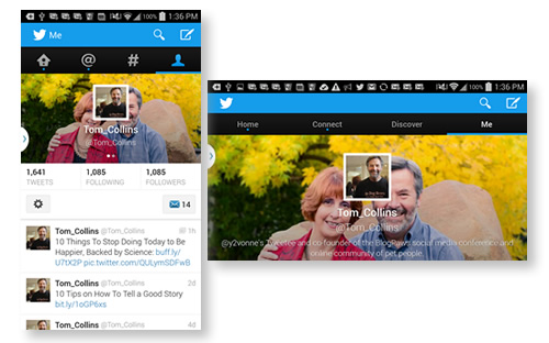
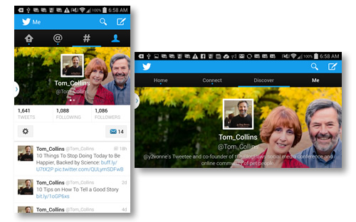
On my Galaxy S4, everything changed! My profile pic displays in the center of the header image. And of course on many smart phones and tablets, the screen rotates between portrait and landscape views, so you need to take that into account, too.
Note how in the landscape view, the header expands to fill the entire screen, pushing your tweet stream completely out of view. If your audience spends a lot of time tweeting from mobile devices, this might push you to consider including some text in your header — also really easy to do in Canva. Just be sure the font, color contrast, and sizing remain readable on the small screen.
One other bit of weirdness (to me), is that Twitter’s new design does not apply to all of your account. At least as of this writing, the pre-April “background” images still show in a few different views, for example your Home view, or when someone clicks to display a single tweet:
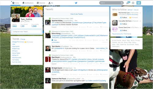

So you’ll want to come up with a background color or image compatible with your new header. Unlike the new header and profile images, which you can access to upload and change right from your profile page, you still have to go into Settings > Design to adjust the background.
Now, back to the inspiration! I’ve grabbed a wide variety of screenshots from Twitter accounts I follow (you’ll recognize many, I’m sure) and grouped them to illustrate three main design choices: simple (which includes the no image examples above), complex images, words and pictures.
“Simple” Twitter Header Images
These examples are really only “simple” in the sense that they are single images, with single subjects. I think they illustrate how much can be communicated this way.
6. Amanda Yantos – @DogMomDays
7. Felissa Elfenbein – @Felissahadas
8. Intrepid Pup – @IntrepidPup
9. Lorie Huston – @LorieAHuston
10. Pawcurious (Dr. V) – @Pawcurious
11. Lisa Taron, The Pet Blog Lady – @ThePetBlogLady

12. Southwest Airlines – @SouthwestAir
13. Ted Nguyen – @TedNguyen
14. Weruva – @weruva_bff
Complex Images
By this I mean images with multiple subjects, or depicting action, even suggesting interaction — among the subjects, or with you.
15. Andrea Arden – @Andrea_Arden
16. Ask Dr. Anna – @Sweetbonana
17. DogTipper – @DogTipper
18. Life with Dogs and Cats – @WithDogsAndCats
19. Maggie Marton – @MaggieMarton
20. Mia Voss, The Mia Connect – @TheMiaConnect
21. MK Clinton – @mk_clinton
22. Pet360 – @Pet360
23. Pet Age Magazine – @PetAgeMag
24. PetMD – @PetMD
25. Steve Dale – @SteveDalePets
26. I Have Cat – @IHaveCat
Words and Pictures
One of my favorite all-time quotes about design comes from Edward Tufte: “Words and pictures belong together.” The Visual Display of Quantitative Information (2nd Ed. 2001). Of course, Tufte wrote that before Twitter existed, let alone released this new responsive layout! ;-D
So how will you overcome the challenges of making your words and pictures work well together, when Twitter’s responsive design displays them across all those screens? Many of these examples work well on my monitor, but you’ll have to figure out what works with your images and text to best tell your story on the screens that matter most to your audience.
27. Aimee Beltran, Irrisistible Pets – @IrresistiblePet
28. Carma Poodale – @CarmaPoodale
29. Carol Bryant – @CarolNBryant
30. Cat CATastrophes – @CatCatastrophes
31. Angie Bailey, CatLadyLand – @CatLadyLand
32. Yasmine Surovec, Cat Vs Human – @yasmine_surovec
33. Elizabeth Keene, Chronicles of Cardigan – @ChroniclesCardi
34. Denise Wakeman – @DeniseWakeman
35. Debbie Glavotsky, Glogirly – @Glogirly
36. Kate Benjamin, Hauspanther – @Hauspanther
37. Cathy Keisha – @CathyKeisha
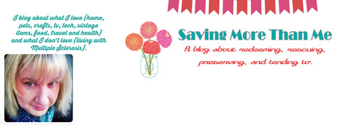
38. Kimberly Dickerson, Saving More than Me – @SavedOneMore
39. Kimberly Gauthier, Keep the Tail Wagging – @TheFurMom
40. Morris Animal Foundation – @Morris_Animal
PLUS, if you’re still in need of even more inspiration you can browse the header image collections at:
- Ginny Soskey’s Hubspot article, 13 Eye-Catching Examples of Twitter’s New Header Images
- Twelveskip’s review of 20 more header images
- TwitrCovers’ vast collection of images
Hope that helps you tap into your creative side!
Let us know how your experimenting, trial-and-error goes. And please share images or links to your own new Twitter designs, or any other designs or resources you find that may help your fellow pet bloggers with theirs.






































One Comment