Why Are Brand Colors Important?
Look at the colors you see around you. Do you know what colors are best for your customers or which colors should be avoided? Color is one of the most influential elements when it comes to marketing. But what are brand colors and why are they so important? Let’s dig a little deeper…

Why is Color So Important in Marketing?
Every color has a meaning and a message behind it, both consciously and subconsciously to the audience. Your goal is to make sure the message is what your customer wants to hear. Color is a powerful tool, yet many marketers neglect the research and importance of using color in their marketing strategy.
When you learn what colors are associated with specific psychological states and find the right color combinations you’ll be one step ahead in creating a business color palette and incorporating it into your marketing.
This image shows how other brands use the psychology of colors to market their business.

Target and Netflix both use red which elicits emotions of strength, excitement, and passion. Pink suggests creativity, imagination, and an assertive mindset as used for T-Mobile and Lyft. Orange is representative of friendliness, cheerfulness, and confidence, while yellow suggests clarity, optimism, and warmth. Bark and Venmo both use blue which triggers feelings of loyalty, dependability, and trust. Whole Foods and Starbucks are representative of growth, freshness, and nature.
Understanding how your target market might react to certain brand colors can help your business be successful when advertising to new customers, and keeping current customers. That’s why it’s important to learn about what colors are associated with specific psychological states and find the right color combinations for marketing your small pet business.
- Red: Strength, excitement, passion, love, and even danger
- Pink: Creative, imaginative, assertive, feminine
- Orange: Friendly, confident, cheerful, energy, bold
- Yellow: Clarity, optimism, warmth, playfulness, positivity
- Blue: Loyalty, dependable, trust, calm, intelligence
- Green: Growth, freshness, nature, wealth, stability
However, these color meanings aren’t set in stone and some even have opposing meanings. For example, red can signify love and also danger (think of stop signs or red traffic lights). And different hues, saturations, and combinations also evoke different emotions.
How Do You Choose A Brand Color Palette?
Before you start choosing business colors, you need to know your brand’s identity, ie. your Mission, Vision, and Values.
A helpful way to determine this is by asking these questions. If you don’t know the answers to these right off the bat, it may be helpful to open a google doc and write what comes to mind.
- Mission (Why did you start this business?)
- Vision (What makes your brand unique and different from your competition?)
- Values (What are the beliefs and values that are important to you as a business?)
- Brand personality (If your brand were a person, what would their personality traits be?)
For example, you’ll notice that Beagle Freedom Project’s mission also aligns with their values. On their FAQ page, before asking supporters to adopt, foster, or donate they first encourage that you live a cruelty-free lifestyle so as not to support any company that tests their products on beagles or other animals, which circles back to their mission.
Beagle Freedom Project
Mission – Beagle Freedom Project is the world’s leading organization for rescuing and rehoming animals used in experimental research.
Values – To live a cruelty-free lifestyle and not support any company that still chooses to test on animals.
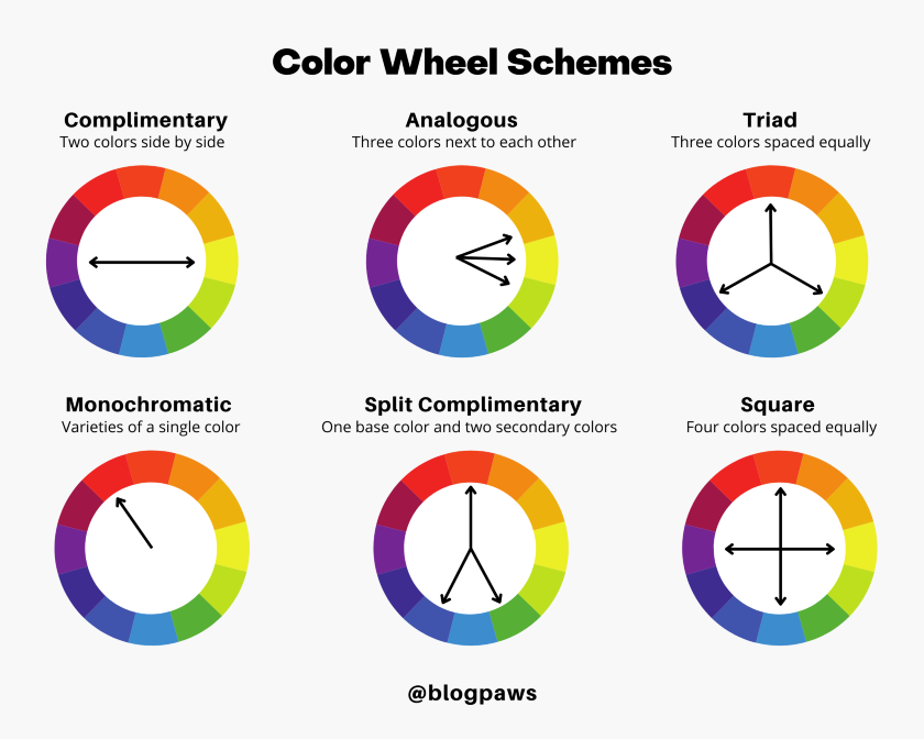
Back to colors! Once you’re confident in your brand identity, you can extract color meanings using the descriptive words in your Mission, Vision, and Values. Sites like Adobe Color and Color Hunt are great tools that can help further define your brand color palette.
Reminiscent of art class many moons ago, Adobe Color offers more information by way of color theory. When you enter the hex # of your main color, you’ll be shown color schemes as they relate to the color wheel: complementary, analogous, triad, monochromatic, split complementary, and square color combinations, plus many more. It’s a great tool to play with if you’re the tiniest bit interested in color. And while Color Hunt focuses only on color palettes, the site is simple with a clean aesthetic and fun to use, even for the not-so-color enthusiasts.
Places to Include Your Brand Colors
Do you know where to use your colors? This is a question that can be difficult to answer because everyone has a different opinion on what colors work best. But it’s important that you include your colors in the right places. This goes beyond just considering logo color schemes.
You will want to use your brand colors on your website and any landing pages you have. A designer can take your brand colors (and brand guidelines if you have them) and create a website mockup. This will help you visualize your brand colors on your website before they’re actually updated and published. A mockup can also be a helpful tool for your developer to have handy when implementing any major changes to your site.
Another place you’ll want to update colors are your social media channels like Instagram, Facebook, Twitter, YouTube, and Pinterest. As far as size, you can use square images for Instagram, Facebook, and Twitter, which means the designs are interchangeable. Arguably, you can use the same template as well, though you may want to design each template with different color variations to keep your content fresh across platforms. Canva will be your best choice for social media content, though there are several more online tools to help you with content.
Your brand colors will also be used in lead magnets as well as print materials such as flyers, brochures, and business cards.
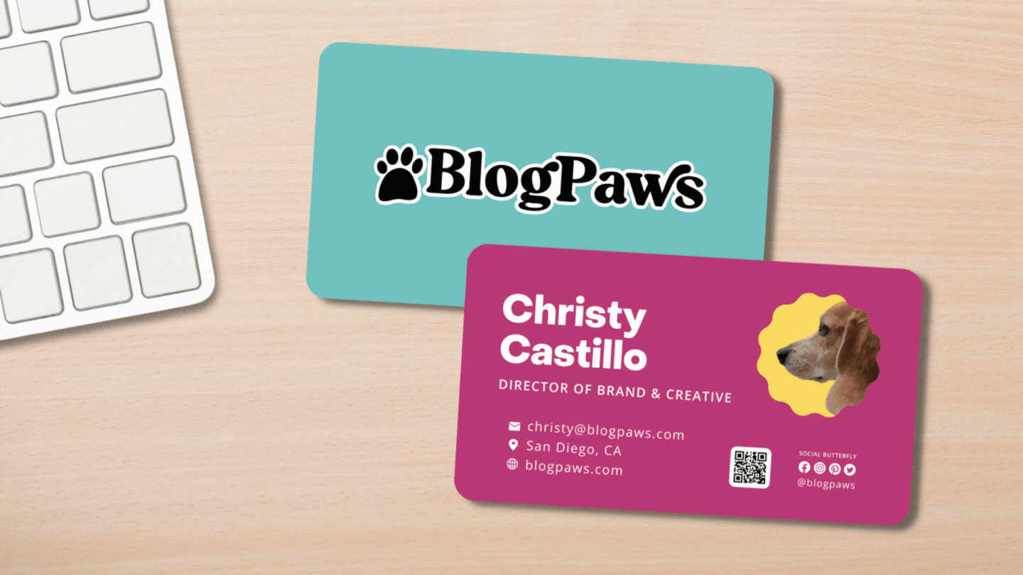
Your brand’s personality can influence how and when you use certain colors. For example, our business cards for BlogPaws each use different colorways, representative of each of the different strengths we bring while coming together as one brand.
However you choose to use your own colors, it’s important to remember that having a consistent brand across all platforms will create a memorable and cohesive identity for your business. Making a decision between which colors to use and where to use them can be challenging. We hope these tips and tricks for choosing a brand color palette have helped and left you with a brand that’s beautiful, consistent, and captures the essence of your business.
How did you select your brand colors? Where do you incorporate them into your marketing to create a consistent brand image?
About the Author: Christy Castillo has worked in the pet industry for 7+ years helping brands with graphic design, branding, video editing and cinematography. When she’s not working or studying she’s exploring the beach and filming videos of her dogs. You can follow her adventures on Insta @hounds.around. Read more…