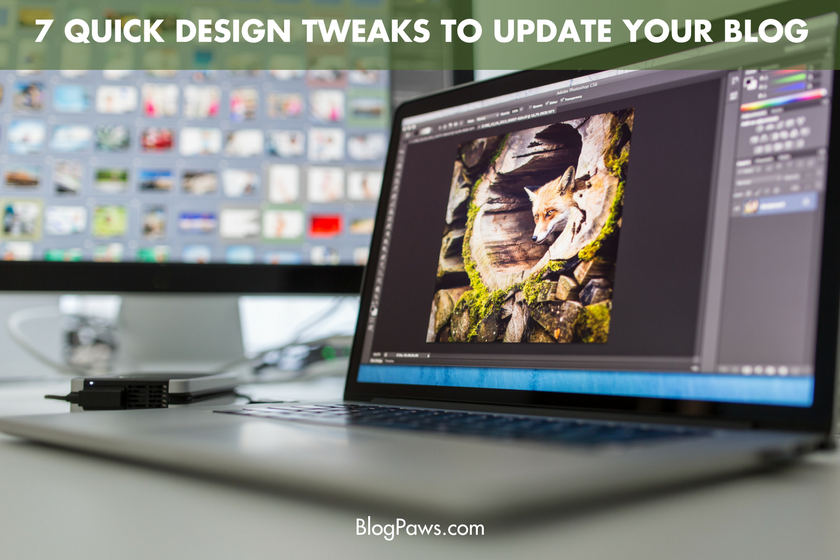
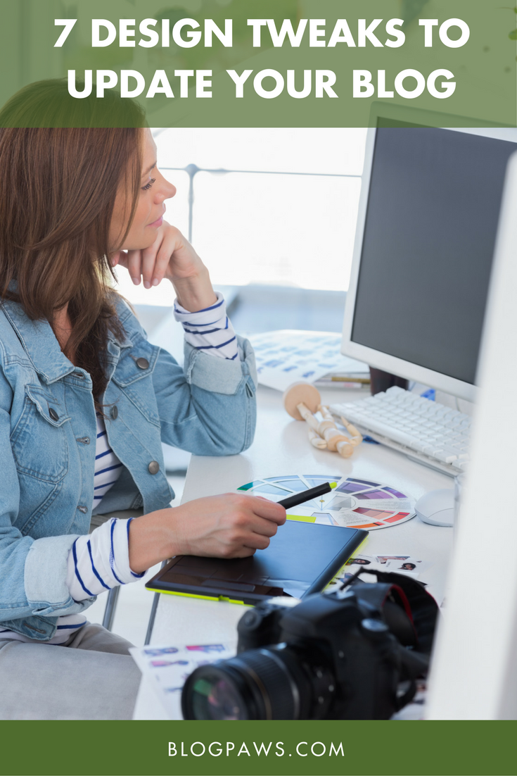
7 Quick Design Tweaks to Update Your Blog for the New Year
If content is king, then good design is the valet who comes in and dresses the king. It’s an important role that’s often overlooked.
While that might be a terrible analogy, it’s important to analyze the dressing of your blog throughout the year.
But, it doesn’t have to be an overwhelming endeavor! Let’s take a top-down approach to evaluating–and tweaking, if necessary–our blog designs. These adjustments make your blog easy-to-navigate for your readers and visually appealing to brands you want to work with.
Each of these 7 quick design tweaks can be knocked out in a weekend but leave a lasting impact.
Your Header
Headers sure have gotten big, haven’t they? A big, bold header that reflects your brand is great… unless it detracts from your content. If your header goes below the fold, ask yourself if that’s serving you and your site, or could you make it a smidge smaller to allow your content to peek out above the fold?
(If you need a refresher on blog layout terms like “above the fold,” take a quick glance at our blog terminology primer!)
Social Follow Buttons
These should be super easy to locate at the top of your site. Brands will scope out your platforms, and readers will want an easy way to follow you. If you make either hunt for the icons to click, you’ll probably lose their attention! Include icons to your biggest and best channels right up at the top.
Search
Have one! And make it easy to find. For loyal readers, those who consider you an authority, they might want to know if, say, you’d ever recommended a particular catnip. So, they’ll search that term. A brand who’s interested in finding influencers who love, for example, hiking with their pets might search your site for hiking-related posts. Help them find what they’re looking for!
Sidebar
Scroll down your site, from the top to the bottom, while looking solely at your sidebar. (Or ask an objective friend to do it for you!) What impression does it give? Hopefully not cluttered and confusing! If your sidebar is chock full of badges and boxes and awards and so on, maybe it’s time to give that section a spruce. Less is more in your sidebar!
Quick tip: Consider linking to a “badges and awards” page on your About or PR pages. It cleans up the sidebar while still allowing you to showcase those honors.
Headshot
If someone met you in person having only ever seen your headshot, would they know it was you? You don’t need to update your headshot too often, but it should be recent and recognizable. And even though we blog about pets, your readers and brands want to know you, the person behind the pet. It doesn’t have to be the biggest picture on your site, but somehwere should live a picture of you.
Watermarks
Watermark your photos. Keep the mark visible, of course, but don’t obscure the subject of the photograph. You don’t need to invest in anything fancy, either. A text overlay with your URL works just as well!
Text and Background
Is your site legible? Can it be read (and skimmed) easily? Even on mobile? The go-to is black text on a white background because it’s clean and readable. White text on colorful backgrounds can be difficult to read, so if you’re using anything but dark text on a light background, consider objectively whether or not it’s serving your audience.
There you have it! Each of these 7 quick design tweaks should only take a couple minutes to evaluate and update, if necessary, yet the results will be long-lasting!
What design tweaks have you made to improve the look of your blog? Do any of these resonate with you or spark ideas for updates?
Maggie Marton serves as the BlogPaws senior editor. When not hiking with her two pit mixes, Emmett and Cooper, or playing with Newt the Cat, Maggie writes about them (and the pet industry) at ohmydogblog.com and maggiemarton.com.
Images: l i g h t p o e t/Shutterstock.com and wavebreakmedia/Shutterstock.com